OVERVIEW
The Tipico Quick Guide is not a substitute for CD manual but a supplement. It serves to get an overview of the most important visual elements of the brand Tipico and better classify the various chapters and parts of the manual. The Quick Guide is also available for download on the right:
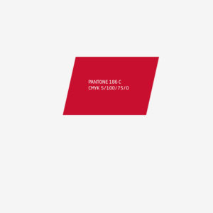
Color Is Presence
Red is the primary color Tipico brand and always the dominant color.
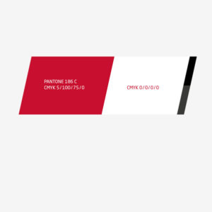
More Contrast
Without contrasts no tension: The brand color red is pure white, and for contrast add a minimum anthracite bzw- blackness.
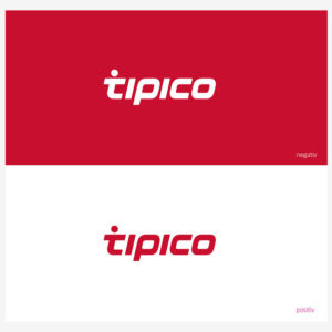
Red & White
For the Tipico Logo There are two color options: red or white. Decisive for the choice of color is the desired effect in the whole picture.
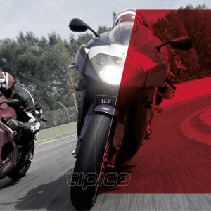
Dynamic
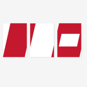
The diagonal is the primary design element of Tipico. Your angle comes from the Tipico logo and is always 12.5 degrees. The diagonal runs always from bottom left to top right.
12.5 Degrees
Is obtained from a diagonal of a whole principle: If we divide a layout using the diagonal, creating a more concise and more varied appearance. It is essential that at least two diagonal should be used per basic layout.
Too Much Is Rarely Good
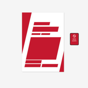
For the diagonal applies: Too much is rarely good. Only through the conscious and limited use they can develop their full effect.
Always On Top
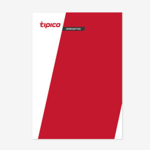
That Tipico logo is always on top. Preferred is the anchor on the diagonal.
Make Statements
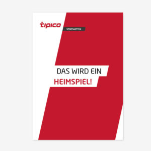
A headline is two things at the headline: content and form. For the type of Tipico headlines applies: Versal and (if possible) in two colors.
