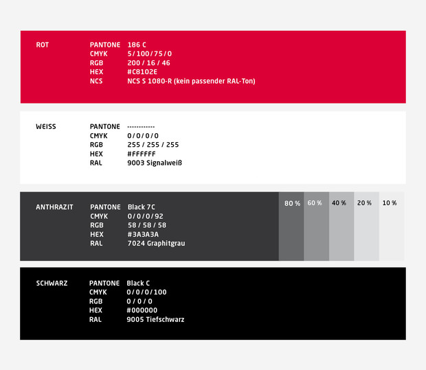
Colors
Red is the primary brand color and always the dominant color. Pair the red with pure white and a minimal amount of black anthracite for contrast.
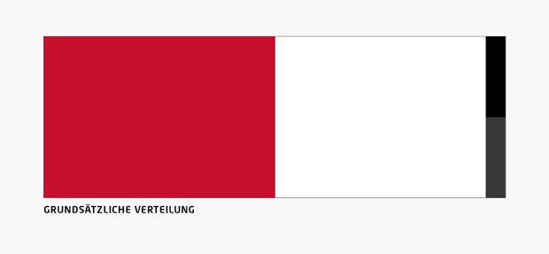
Color Hierarchies
The color concept is based on the theme of energy and excitement. This tension is translated in the form of strong and striking contrasts. We reach these contrasts by choosing an appropriate color distribution of the colors Red, White and Black / Anthracite are available.
Anthracite and black serve as a “contrasting donors” and is used only to a very limited extent. The contrast can be produced in various ways such as by using the key visuals (black), pictures with blackness or strong contrasts, or with a counter-diagonal in anthracite.
Important is the correct distinction between black and anthracite. The brand appendix and the counter-diagonal are to be implemented in anthracite. Typography and key visuals are to be implemented in black.
[su_row]
[su_column size=”1/2″]
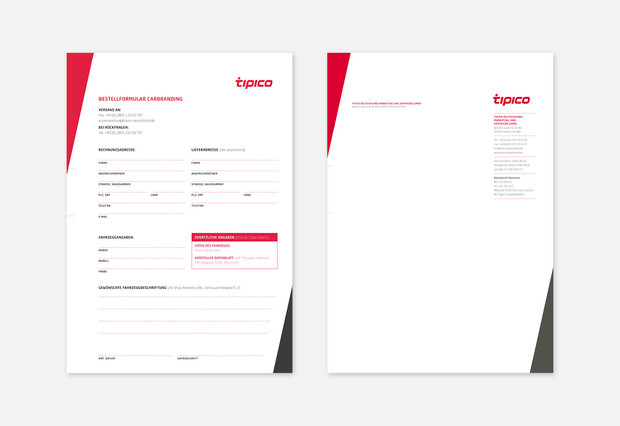
Higher amount of red
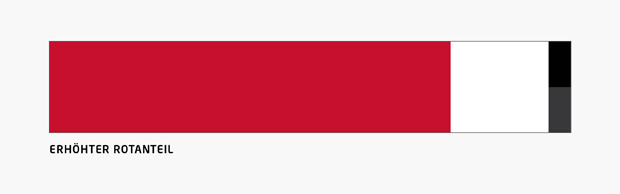
For bold and commercial applications, an increased amount of red is the right choice.
[/su_column]
[su_column size=”1/2″]
Higher amount of white
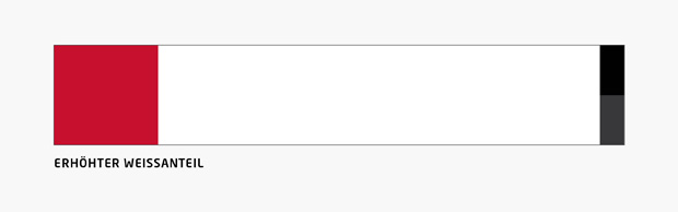
White and white space is essential and must be applied in each layout, eg. for corporate communications or are designed for other reasons more cautious, use a much larger part of the white and less red.
[/su_column]
[/su_row]