The Tipico logo is the result of consistent development of our corporate design. It helps us to strengthen our visual presence and to increase the recognition of our brand. The logo is the most important part of our visual identity and should be treated with appropriate care. The correct use helps us to maintain our strong market position and expand continuously.
Ingredients
The Tipico logo includes not only the actual logo shape ('Tipico') but also a pictogram-like figurative mark in the form of Tipico- "t", which is described separately under the menu item figurative mark 't'.
Logo and Design System
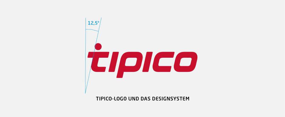
The Tipico logo is the core of our corporate design and the basis for the entire corporate design system. The inclination of the letters (12.5 °) is the angle of the central design element "diagonal" (Chapter Design System).
Colors
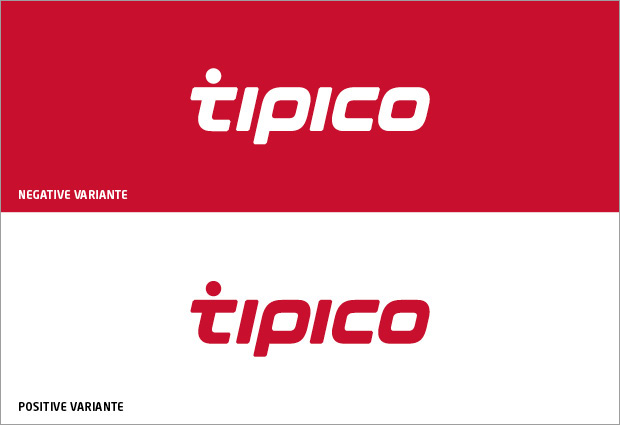
For the Tipico Logo there are two color options: red on white background (positive) or white on red background (negative). Decisive for the choice of color is the desired effect in the overall picture:
The negative variation has a strong long-range effect and is ideal for shop and sponsorship applications where a strong presence is important.
The positive application is somewhat reduced and is ideal for posters in the shop environment or business stationery.
Minimum Distance
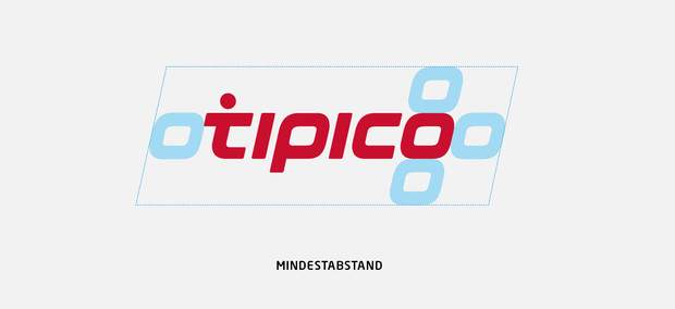
To develop its presence, the logo requires enough space and distance to other elements. The minimum distance is one "o" of "Tipico". The below parallelogram indicates the positioning in relation to the design of the system and is not part of the logo.
Note: For some applications, such as sponsorship and branding shop the minimum distance is defined separately and will be shown in the relevant sections of the manual.
Position and Size
For print products it's placement is recommended in the top fifth. The logo is primarily on the left side. Exceptions are for example, the letterhead or other media, where, for reasons of solidarity, an alternative placement is useful. When using a format-splitting diagonal (see Design System), the logo is always to the left and connected to the diagonal.
Logo Sizes
The size of the logo depends on the format used. For print media, the following variables were defined as a recommendation. The logo must always be increased in proportion and must never be distorted. The indicated sizes refer to the logo without appendix (see Markenappendix).
| Papierformat | Formatgröße (mm) | Logobreite (mm) |
|---|---|---|
| A0 | 841 x 1189 | 180,0 mm |
| A1 | 594 x 841 | 115,0 mm |
| A2 | 420 x 594 | 82,0 mm |
| A3 | 297 x 420 | 63,5 mm |
| A4 | 210 x 297 | 40,0 mm |
| A5 | 148 x 210 | 31,5 mm |
| A6 | 105 x 148 | 22,4 mm |
| DIN Lang | 210 x 100 | 34,3 mm |
| Visitenkarte | 85 x 55 | 23,2 mm |
Any intermediate sizes must be calculated separately. Here is the logo size be based on the next smaller or larger size and are scaled accordingly. It is important not to fall below the minimum distance and to ensure the overall context.
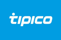
falsche Fondfarbe
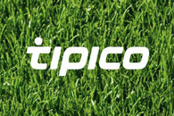
unruhiger Hintergrund
Markenzusätze
rotiertes Logo
schräggestelltes Logo
Logo mit Schatteneffekt

