TYPOGRAPHY
Our own typeface Tipico Sans has been developed in 2016 is currently being rolled out. This section will be updated accordingly soon.
NEO SANS (2013-2016)
Typography is a supporting element of our corporate design. The correct use of fonts contributes significantly to our appearance. The typeface of Tipico is the Neo Sans. It embodies in its modernity the values and ideas of our brand. The Neo Sans is used in all media, and represents the sole typeface. One exception are web applications, where Neo Sans can be substituted with Arial or Helvetica for reasons of performance.

Three weights of the Neo Sans are used: Neo Sans Light, Neo Sans Regular, Neo Sans Medium. The usage is regulated as follows:

I'm the Neo Sans Light. My applications include body copy such as in letterheads and brochures.

I'm the Neo Sans Regular. My applications include Headlines (VERSAL) as well as highlights in the text.
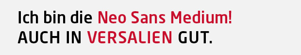
I'm the Neo Sans Medium. My applications include subheadings (VERSAL) as well as highlights in the text.